Commons:Graphic Lab/Map workshop
| Illustration Workshop | Map Workshop | Photography Workshop | Video and Sound Workshop |
 Map workshop
This workshop is part of the Graphics Lab, a project aimed at picture retouching to improve the graphical content of the Wikimedia projects. More information about the lab can be found on its main page and requests pages (Illustrations ; Photographs ; Maps ; Video and Sound). To ask questions or make a suggestions, see the talk page of the graphic lab page.
This specific page is the requests page for the Map Workshop. Anyone can make a request for a map to be created or improved. The standard format for making a request is shown below, along with general advice, and should be followed.
Make a request
Use the following template when making a new request, replacing the examples with your image(s) and request(s):
<gallery>
 IMAGENAME.EXT|Description of image
 IMAGE#TWO.EXT|2nd image (If there is one)
 ETCETCETC.EXT|Don't request too many at once, though
</gallery>

;Request:
: Details of your request go here… --~~~~
;Graphist opinion(s):
See also[edit]
| SpBot archives all sections tagged with {{Section resolved|1=~~~~}} after 7 days and sections whose most recent comment is older than 185 days. For the archive overview, see /Archive. The latest archive is located at /Archive/2022. |
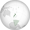
Highlight East timor[edit]
.svg/120px-Indonesia_1976-1998_(orthographic_projection).svg.png)
Indonesia in 1993 with east timor
Reference 2
.svg)

Article(s): New Order
- Request
- Please Highlight East Timor like New Zealand territories in the second image. Also change the color please.
- Graphist opinion(s)
Locator map of Kurdistan[edit]

Kurdish inhabited areas, with countries boundaries
.svg/120px-Kurdish_inhabited_areas_(orthographic_projection%2C_no_borders).svg.png)
Kurdish inhabited areas, without boundaries
.svg/120px-Kurdish_inhabited_areas_(mercator_projection).svg.png)
Detailed map, mercator projection

.svg)
.svg)
Article: e.g. Kurds, Kurdistan
- Request
- Adapt Map 0.2 from The Cambridge History of the Kurds
- Make a standard grey-green location map for the same area as is marked on Map 0.2 on page xxviii of The Cambridge History of the Kurds (Bozarslan, Gunes, & Yadirgi, 2021). The "Map of Kurdish inhabited areas" should be laid over the typical grey-green orthographic projection centred on, say, Jazirat ibn ʿUmar (Turkish: Cizre). Versions with and without international borders would both be useful. GPinkerton (talk) 20:54, 5 October 2021 (UTC)
- Graphist opinion(s)
| Extended content |
|---|
This is important as it gives me information on how I/we can use it. --please ping me-- Goran tek-en (talk) 15:21, 21 October 2021 (UTC)
@GPinkerton: I really would need to know if you want me to withdraw my take so someone else can work on this, thanks. --please ping me-- Goran tek-en (talk) 19:08, 1 November 2021 (UTC)
|
- Hi @GPinkerton: , what you are requesting is really complex. Orthographic maps are generated using existing shapefiles (the format to encode geographical locations).
Converting an image into a shapefile is quite complex. You could do it using QGIS, but it's not a simple task. to be honest I haven't seen other historical maps represented with orthogonal projection. Sette-quattro (talk) 12:40, 29 November 2021 (UTC)
- Hi @GPinkerton: , i've done it. It has been a really complex task but I learnt lots of stuff. All the metadata must be added. Let me know what do you think and in case mark it as done Sette-quattro (talk) 18:35, 16 December 2021 (UTC)
- @Sette-quattro: Hi thanks so much for doing this! I'm very impressed. Would it be possible to make a version without the white political borders? Additionally, it would also be great to have a flat map of the same area (did you make a new shapefile for the highlighted areas?) such a map would be good to have for the making the details of the region more visible. GPinkerton (talk) 01:55, 11 January 2022 (UTC)
- Sure, as soon as I have time. I don't know if there are established practices on how to share on commons shapefiles, i'd like to do so. I can upload a newer version without political boundaries.
- I can also produce a mercator projection (flat map) of the area. should I add or not political boundaries?
- Best --Sette-quattro (talk) 08:35, 11 January 2022 (UTC)
- @Sette-quattro: Political boundaries would be most useful, though a version without could also be helpful. If the borders are shown, then it would be good if they went over the top of the green area, so as to still be visible there. GPinkerton (talk) 16:48, 11 January 2022 (UTC)
- @GPinkerton: I only had time now to add the two versions you requested, please let me know if they are fine. in case mark the section as solved! BestSette-quattro (talk) 14:24, 6 May 2022 (UTC)
- @Sette-quattro: Political boundaries would be most useful, though a version without could also be helpful. If the borders are shown, then it would be good if they went over the top of the green area, so as to still be visible there. GPinkerton (talk) 16:48, 11 January 2022 (UTC)
- @Sette-quattro: Hi thanks so much for doing this! I'm very impressed. Would it be possible to make a version without the white political borders? Additionally, it would also be great to have a flat map of the same area (did you make a new shapefile for the highlighted areas?) such a map would be good to have for the making the details of the region more visible. GPinkerton (talk) 01:55, 11 January 2022 (UTC)
- Hi @GPinkerton: , i've done it. It has been a really complex task but I learnt lots of stuff. All the metadata must be added. Let me know what do you think and in case mark it as done Sette-quattro (talk) 18:35, 16 December 2021 (UTC)
Location Maps of Mid-Atlantic and Northeast United States[edit]
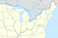
Existing map of the northeast United States

Existing map of the Mid-Atlantic United States
.svg/120px-USA_Northeast_(cropped).svg.png)
Cropped version of first map

Cropped (to Midatlantic states) version of the first map

Mid-Atlantic states (WGS84)

Northeastearn states (WGS84)


.svg)


Article(s): Various
- Request
- The existing location maps of the Mid-Atlantic and Northeast United States cover an area much more broad than what is usually considered part of both of those two areas. (see [1] and [2] for reference) This means that it is more likely that location maps that have multiple marks will be difficult to read due to overlap. (Yes, I know that a magnified version wouldn't solve all of the problems in this example, but it would still be useful more broadly.) Therefore, a version of the Northeast map above showing only roughly the area from central Ohio east and northern Virginia north and a version of the Mid-Atlantic map above showing only the area from eastern Massachusetts west, northern North Carolina north, and the Canadian border south would be helpful. –Noha307 (talk) 01:16, 25 October 2021 (UTC)
- Graphist opinion(s)
![]() Done Both. I didn't use the second, because it's a PNG, but the first was useable for both. MjolnirPants (talk) 15:25, 1 November 2021 (UTC)
Done Both. I didn't use the second, because it's a PNG, but the first was useable for both. MjolnirPants (talk) 15:25, 1 November 2021 (UTC)
- MPants at work, The map for Mid-Atlantic States has clipped Long Island from NYS. I recommend extending the right boundary to include that. Also, it would be helpful to get the extent in lat/long for each so they be can used in a {{Location}} template. Thanks for taking on Noha307 's request. - DutchTreat (talk) 10:30, 9 November 2021 (UTC)
- I've added back in Long Island. As for the geo coordinates, those are not embedded in the files, and not formally defined as far as I'm aware. I just looked at it in Google Earth and the mid-Atlantic region is roughly bound at [46.567394,-82.145506],[35.161925,-71.515667]. You can get the coordinates for the first map the same way (the current coordinates of the cursor are shown at the bottom right of the Google Earth viewport pane). MjolnirPants (talk) 13:40, 9 November 2021 (UTC)
- MPants at work Yes, thanks for doing this. I appreciate it.
- DutchTreat I considered doing the work myself, but not knowing how to add the location map functionality was one of the things that stopped me. (Another is my limited skill with vector editing programs.) After a bit of looking around, I came across an explanation of the process, so I'll try to take a whack at it when I get a chance. I might be able to add the {{Location}} template you mentioned at the same time, but I'm not sure how this would work with an image depicting an area more broad than just a single point as the template does not appear to be designed for that capability. –Noha307 (talk) 06:00, 11 November 2021 (UTC)
- Noha307 No worries. I will help you turn these into locator maps. Due to my schedule, I'll need a few days to complete. - DutchTreat (talk) 10:29, 11 November 2021 (UTC)
- DutchTreat Thanks! I appreciate the help! I didn't want to leave all the work up to you, so I tried creating modules and documentation pages for the maps (1, 2) based off of the example the image file was based on and I think I got most of it correct. However, what I'm stuck on is that I don't know how to obtain the exact coordinates for the edges of the maps. I was able to get the sample pushpins in the documentation close based on guess and check by slightly adjusting them and then using the page preview, but I'm sure it's slightly off. The USA Northeast map also uses some sort of calculation I am not familiar with to correct for the distortion of the map projection. –Noha307 (talk) 22:09, 14 November 2021 (UTC)
- Noha307 Good start! I agree the issue is with the projection needs to correct for a different Coordinate Reference System (CRS). Let me have a look to see if I can fix it. - DutchTreat (talk) 12:55, 21 November 2021 (UTC)
- DutchTreat Did you have any luck correcting the coordinates for the location maps? –Noha307 (talk) 01:03, 7 December 2021 (UTC)
- Noha307 Good start! I agree the issue is with the projection needs to correct for a different Coordinate Reference System (CRS). Let me have a look to see if I can fix it. - DutchTreat (talk) 12:55, 21 November 2021 (UTC)
- DutchTreat Thanks! I appreciate the help! I didn't want to leave all the work up to you, so I tried creating modules and documentation pages for the maps (1, 2) based off of the example the image file was based on and I think I got most of it correct. However, what I'm stuck on is that I don't know how to obtain the exact coordinates for the edges of the maps. I was able to get the sample pushpins in the documentation close based on guess and check by slightly adjusting them and then using the page preview, but I'm sure it's slightly off. The USA Northeast map also uses some sort of calculation I am not familiar with to correct for the distortion of the map projection. –Noha307 (talk) 22:09, 14 November 2021 (UTC)
- Noha307 No worries. I will help you turn these into locator maps. Due to my schedule, I'll need a few days to complete. - DutchTreat (talk) 10:29, 11 November 2021 (UTC)
- I've added back in Long Island. As for the geo coordinates, those are not embedded in the files, and not formally defined as far as I'm aware. I just looked at it in Google Earth and the mid-Atlantic region is roughly bound at [46.567394,-82.145506],[35.161925,-71.515667]. You can get the coordinates for the first map the same way (the current coordinates of the cursor are shown at the bottom right of the Google Earth viewport pane). MjolnirPants (talk) 13:40, 9 November 2021 (UTC)
Noha307 - Sorry, no progress in learning how to do the CRS transform formulas. I looked the ones for wikipedia:Module:Location_map/data/USA and wikipedia:Module:Location_map/data/USA_Northeast. There appears to be a basic substitution needed, but I'm not sure what that should be. - DutchTreat (talk) 12:11, 8 December 2021 (UTC)
- DutchTreat No problem, thanks for trying anyway. –Noha307 (talk) 04:33, 14 December 2021 (UTC)
- @Noha307: I received some background info from User:Sting. I am now thinking it would be best for me to re-draw the map with a equirectangular projection. - DutchTreat (talk) 21:00, 14 December 2021 (UTC)
- @Noha307: Completed two maps using a equirectangular projection Mid-Atlantic states and Northeastearn states. I updated your mod w:Module:Location map/data/USA Mid-Atlantic. I noticed that Dmm1169 on 15 December a new mod w:Module:Location map/data/USA Northeastern. I started a discussion on the talk page to determine which map file to use there. - DutchTreat (talk) 13:30, 16 December 2021 (UTC)
- The file w:Module:Location map/data/USA Northeastern was created for the module. Creating the module is simpler using a Mercator projection map where the borders can be defined by a simple lat/long. It does include [[Mid-Atlantic states so I'd be ok if it's renamed USA Mid-Atlantic and Northeast if that's better.-Dmm1169 (talk) 15:38, 16 December 2021 (UTC)
- @Dmm1169: I agree that a projection that is equirectangular is preferred. I also support two modules: one for Northeast (zoomed in from the current larger one starting in the midwest) like you created and a second module for the middle Atlantic states. My comment was on the module for USA Northweastern. I prefer the SVG map file. Hope that helps clarify my position. - DutchTreat (talk) 14:03, 18 December 2021 (UTC)
- DutchTreat, Dmm1169: I appreciate the help guys. Since I understand that pushpin location maps are somewhat falling out of favor anyway, I was going to suggest just dropping the effort due to the complications. Thanks for continuing on.
- I feel like USA Northeast should be renamed – the similarity of the name to USA Northeastern is already confusing me. However, I can't think of a better name as there doesn't seem to be any generally accepted term for the region of the United States it depicts. Any ideas? (Sorry Dutch, I like SpongeBob as much as the next guy, but I don't think "USA Northweastern" is going to work as a title.) The best I can come up with is "Midwest and Northeast".
- Also, should w:Module:Location map/data/USA Northeast (cropped) be deleted? If it is left up I am afraid people might try to use it without knowing it won't display locations accurately. –Noha307 (talk) 20:30, 20 December 2021 (UTC)
- @Dmm1169: I agree that a projection that is equirectangular is preferred. I also support two modules: one for Northeast (zoomed in from the current larger one starting in the midwest) like you created and a second module for the middle Atlantic states. My comment was on the module for USA Northweastern. I prefer the SVG map file. Hope that helps clarify my position. - DutchTreat (talk) 14:03, 18 December 2021 (UTC)
- The file w:Module:Location map/data/USA Northeastern was created for the module. Creating the module is simpler using a Mercator projection map where the borders can be defined by a simple lat/long. It does include [[Mid-Atlantic states so I'd be ok if it's renamed USA Mid-Atlantic and Northeast if that's better.-Dmm1169 (talk) 15:38, 16 December 2021 (UTC)
- @Noha307: Completed two maps using a equirectangular projection Mid-Atlantic states and Northeastearn states. I updated your mod w:Module:Location map/data/USA Mid-Atlantic. I noticed that Dmm1169 on 15 December a new mod w:Module:Location map/data/USA Northeastern. I started a discussion on the talk page to determine which map file to use there. - DutchTreat (talk) 13:30, 16 December 2021 (UTC)
- @Noha307: I received some background info from User:Sting. I am now thinking it would be best for me to re-draw the map with a equirectangular projection. - DutchTreat (talk) 21:00, 14 December 2021 (UTC)
Maps of USA Northeast # Map Next steps 1 USA Northeast Rename - "USA Midwest and Northeast"
I like Noha307's proposal.2 USA Northeastern Update - swap image from "USA Northeastern.png" to "USA Northeast location map.svg".
The SVG map I created has the following advantages. (a) Uses color coding to clearly define which states are in the region. (b) It uses a scaleable SVG format. (c) Zoomed in to provide better definition.
I'll let community consensus drive the result, since I created this map.3 USA Northeast (cropped) Delete not used as of 2021-12-22.
This map is not needed. Could cause confusion.4 USA Mid-Atlantic No changes
Sorry about the typo for "Northweastern", but glad it provided some unintended humor! - DutchTreat (talk) 11:46, 22 December 2021 (UTC)
- @DutchTreat Sorry it took so long, but the image file and associated template and documentation for USA Northeast has been renamed to USA Midwest and Northeast. I haven't had a chance to address the other ones. –Noha307 (talk) 01:30, 7 March 2022 (UTC)
Topographic map with contours highlighted[edit]
Article(s): en:Lake Estancia
- Request
- Is it possible to get a topographic map of the en:Lake Estancia basin with the 1897m ("late Estancia"), 1939m ("early Estancia") and 1870m ("Lake Willard") elevation contours highlighted and labelled? --Jo-Jo Eumerus (talk) 15:52, 22 January 2022 (UTC)
- Graphist opinion(s)
 Done File:Lake Estancia and Lake Willard.png --Guerillero 10:20, 26 January 2022 (UTC)
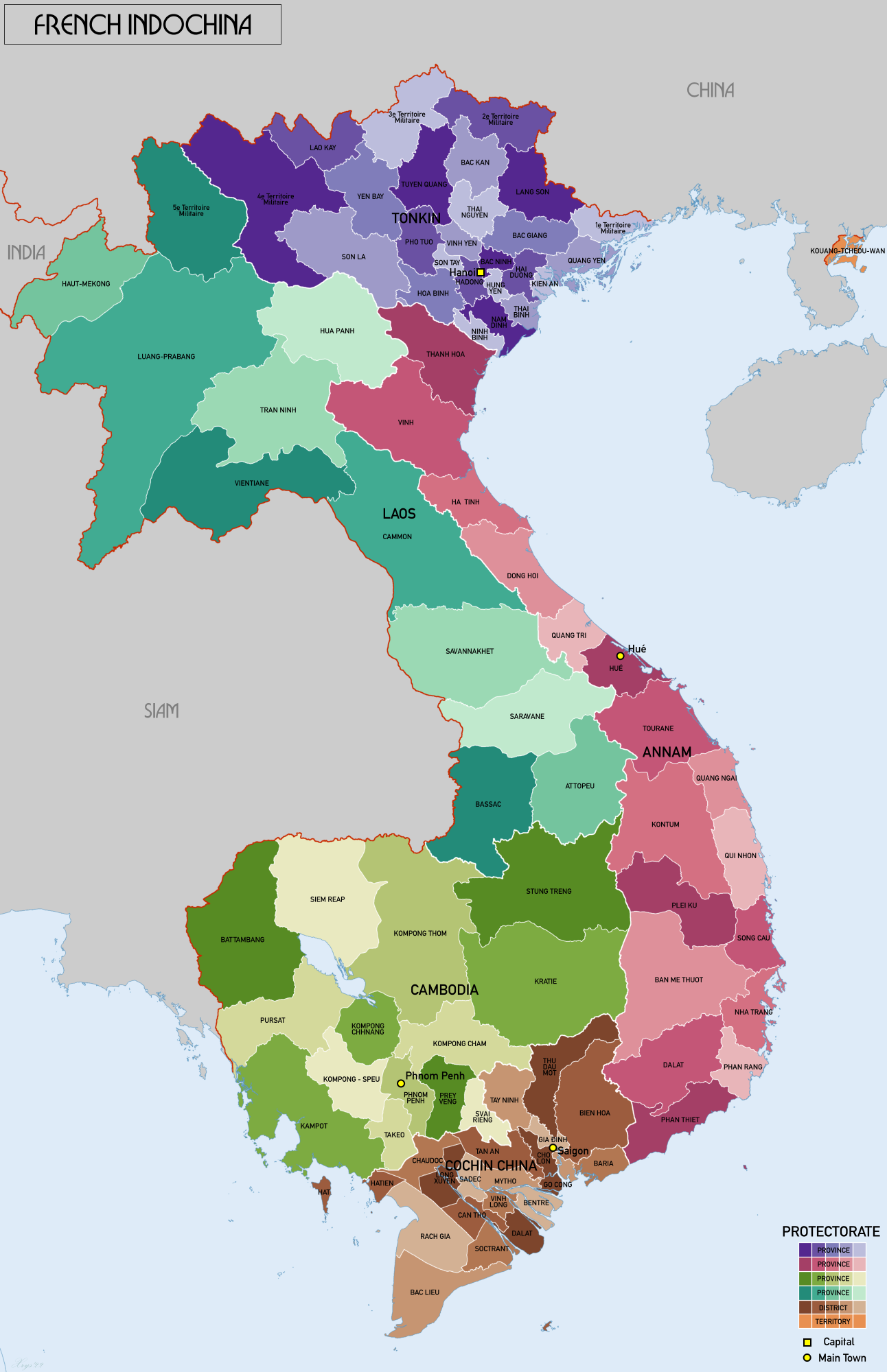
Map of the French protectorates of Annam and Tonkin in 1937[edit]
Overview of the request[edit]

A map of the first (1st) and second (2nd) level subdivisions of French Indo-China in the Gregorian year 1937.
.svg/85px-Nguyen_Dynasty%2C_administrative_divisions_map_(1838).svg.png)
Map of the Nguyễn Dynasty in 1838.

Additional map of French Indo-China, for reference.

Concept image of the map I want to have created.

Concept of how the names would look like, though the purple areas shouldn't show the provincial boundaries, only the boundaries of the federal components of French Indo-China.

.svg)


Article(s): en:Nguyễn dynasty
- Request
I would like to request the creation of a map of the provinces of the Nguyễn Dynasty in 1937 based on the above maps. The French protectorate of Tonkin should be red while the French protectorate of Annam yellow to reflect the map of the Nguyễn Dynasty under the Minh Mạng Emperor above, the rest of French Indochina should be a very light shade of purple (or as transparent as possible) to indicate that Đại-Nam is a part of the Union of Indo-China but clear enough that the observer will see that the rest of French Indo-China is not a part of Đại-Nam.
The best way to do this is by using the map and code of "File:Nguyen Dynasty, administrative divisions map (1838).svg" as the base, use the administrative boundaries and names of "File:French Indochina 1937.png", and then use the general layout and colour scheme of "File:Nguyễn Dynasty in 1937 concept map.png".
- Differences between French and Nguyễn names and notes.
Also note that the Nguyễn Dynasty maintained different names for several provinces than the French, for example "1e Territoire Militaire" should be called "Hải Ninh 海寧" and "2e Territoire Militaire" should be called "Cao Bằng 高平".
On Wikipedia I find that the Đắk Lắk Province was split before this "1931: it consisted of 5 provinces: Buôn Ma Thuột, Buôn Hồ, Đắk Song, Lak, M'Đrăk", but I can't find any other maps than the one I have of 1937. Likewise before 1950 Vĩnh Phúc (永福) was the provinces of Vĩnh Yên (永安) and Phúc Yên (福安), but I can't find that in the source map. I suppose that improvements can be made with better sources available as SVG files can constantly be improved. Additional sources can simply be added at the list of sources in the file description in the future, I know a WikiCartographer who was really knowledgeable about these things, but she retired, so I'm basing it now mostly on the 1937 map.
- Colours
Red = Xứ bảo hộ Bắc Kỳ - 處保護北圻
Yellow = Xứ bảo hộ Trung Kỳ - 處保護中圻
Purple (very light purple) = Phần còn lại của Đông Dương 份群賴𧵑東洋
- Text in the box
ĐẠI NAM QUỐC 大南國 Bảo Đại năm thứ 12 - 保大拾貳年 1937 - MCMXXXVII
File layout[edit]
- Publishing information
- File name = "File:Nguyễn Dynasty, administrative divisions map (1937).svg".
- File caption = A map of the administrative divisions of the Nguyễn Dynasty in the year 1937 (Bảo Đại 12) within French Indochina.
- File description = A map of the administrative divisions of the Nguyễn Dynasty in the year 1937 (Bảo Đại 12) within French Indochina.
- Xứ bảo hộ Bắc Kỳ - 處保護北圻 - Protectorat français du Tonkin
- Xứ bảo hộ Trung Kỳ - 處保護中圻 - Protectorat français d'Annam
Sources: "File:French Indochina 1937.png"
- License = Uploader's choice.
- Categories = "Category:Historical regions of the Nguyễn Dynasty" & "Category:Maps of French Indochina"
French Indo-China and foreign countries[edit]
- Other states of French Indo-China
- Laos = Xứ Bảo hộ Lào 處保護寮
- Cambodia = Xứ Bảo hộ Campuchia 處保護高棉
- French Cochinchina = Xứ thuộc địa Nam Kỳ 處屬地南圻
- Guangzhouwan = Lãnh thổ Quảng Châu Loan 領土廣州灣
- Foreign countries
- Republic of China = Trung Quốc 中國
- Kingdom of Thailand = Thái Lan 泰闌
- British Raj = Ấn Độ 印度
Provinces[edit]
Generally left-to-right, up-to-down. Based on the provinces found at: https://upload.wikimedia.org/wikipedia/commons/7/79/French_Indochina_1937.png
Capital cities in bold.
French Protectorate of Tonkin[edit]
- 4e Territoire Militaire = Lai Châu 萊州
- Lao Kay = Lào Cai 老街
- 3e Territoire Militaire = Hà Giang 河楊
- 2e Territoire Militaire = Cao Bằng 高平
- Yen Bay = Yên Bái 安沛
- Tuyen Quang = Tuyên Quang 宣光
- Bac Kan = Bắc Kạn 北𣴓
- Lang Son = Lạng Sơn 諒山
- Thai Nguyen = Thái Nguyên 太原
- Son La = Sơn La 山羅
- Phu Tuo = Phú Thọ 富壽
- Vinh Yen = Vĩnh Yên 永安
- Bac Giang = Bắc Giang 北江
- 1e Territoire Militaire = Hải Ninh 海寧
- Son Tay = Sơn Tây 山西
- Hadong = Hà Đông 河東
- Hanoi = Hà Nội 河內
- Bac Ninh = Bắc Ninh 北寧
- Hai Duong = Hải Dương 海陽
- Kien An = Kiến An 建安
- Quang Yen = Quảng Yên 廣安
- Hoa Binh = Hòa Bình 和平
- Hung Yen = Hưng Yên 興安
- Ninh Binh = Ninh Bình 寧平
- Nam Dinh = Nam Định 南定
- Thai Binh = Thái Bình 太平
French Protectorate of Annam[edit]
- Thanh Hoa = Thanh Hóa 清化
- Vinh = Nghệ An 乂安
- Ha Tinh = Hà Tĩnh 河靜
- Dong Hoi = Quảng Bình 廣平
- Quang Tri = Quảng Trị 廣治
- Hué (province) = Thừa Thiên 承天
- Hué (ville) = Huế 化
- Tourane = Quảng Nam 廣南
- Kontum = Kon Tum 崑嵩
- Quang Ngai = Quảng Ngãi 廣義
- Quy Nhon = Bình Định 平定
- Plei Ku = Pleiku 坡離俱
- Song Cau = Phú Yên 富安
- Ban Me Thuot = Đắk Lắk 得勒
- Nha Trang = Nha Trang 芽莊
- Dalat = Đà Lạt 多樂
- Phan Rang = Ninh Thuận 寧順
- Phan Thiet = Bình Thuận 平順
French-administered cities[edit]
These should be marked with a yellow circle, while Huế a yellow square.
- Hanoi = Hà Nội 河內
- Haiphong = Hải Phòng 海防
- Da Nang = Đà Nẵng 沱㶞
Discussion[edit]
I hope that I've made the request clear enough to be easily taken. If you have any questions then please ping me. --Donald Trung 『徵國單』 (No Fake News 💬) (WikiProject Numismatics 💴) (Articles 📚) 10:48, 29 January 2022 (UTC)
 Addendum Also, the names of bodies of water 💧 (like rivers, seas, and gulfs) remain the same from the 1838 map. --Donald Trung 『徵國單』 (No Fake News 💬) (WikiProject Numismatics 💴) (Articles 📚) 10:54, 29 January 2022 (UTC)
- Note, the creator of the original map told me that she made it using Adobe Illustrator. I'm not versed enough in Adobe Illustrator to try and re-create a map of French Indo-China using the software which is why I've made an updated version of the concept map above. She also used a hand-drawn version of Traditional Chinese characters which I would recommend not emulating as the standardised Traditional Chinese characters you can write are useable here. --Donald Trung 『徵國單』 (No Fake News 💬) (WikiProject Numismatics 💴) (Articles 📚) 21:08, 16 April 2022 (UTC)
- I've attempted to made it without much success, namely in my version of Adobe Illustrator the lines seem to move around. There's no need to emulate the Traditional Chinese characters of the Minh Mạng map, using standard Traditional Chinese characters will probably look better too. --Donald Trung 『徵國單』 (No Fake News 💬) (WikiProject Numismatics 💴) (Articles 📚) 18:19, 29 May 2022 (UTC)
- Graphist opinion(s)
South Sudan borders required in orthographic maps[edit]
.svg/120px-Russian_Federation_(orthographic_projection).svg.png)
File:Russian Federation (orthographic projection).svg

File:Rossija globus.png
.jpg/120px-Kashmir_(orthographic_projection).jpg)
File:Kashmir (orthographic projection).jpg should be like File:Kashmir (orthographic projection).svg and the green dot in the JPG map needs to be removed

File:Togoland map.png
File:German sw africa map.png

File:German east africa map.png
.svg/120px-Vietnam_(orthographic_projection).svg.png)
File:Vietnam (orthographic projection).svg where the border of South Sudan is very inaccurate, in other words, wrong

File:Undivided India.jpg
.svg/120px-Iraq_(orthographic_projection).svg.png)
File:Iraq (orthographic projection).svg
.png/120px-Cyprus_(orthographic_projection).png)
File:Cyprus (orthographic projection).png

File:East Asian Cultural Sphere - Updated.png

File:East Asian Cultural Sphere - Sinocentist.png
.svg/120px-Empire_of_the_Great_Qing_(orthographic_projection).svg.png)
File:Empire of the Great Qing (orthographic projection).svg
.png/120px-Greater_Mongolia_(orthographic_projection).png)
File:Greater Mongolia (orthographic projection).png
.svg)

.jpg)


.svg)

.svg)
.png)


.svg)
.png)
Article(s): Numerous articles across Wikipedia.
- Request
- The borders of South Sudan need to be added in these orthographic maps. --Maphobbyist (talk) 14:14, 4 February 2022 (UTC)
- Graphist opinion(s)
File:Krystal-vs-whitecastle-locations-map.svg[edit]

Description of first image
- IMAGE2.EXT
Description of second image (if needed)
- IMAGE3.EXT
Description of third image (if needed; don't request too many at once, though)

Article(s):
- Request
- Please make Florida purple as it has both White Castle and Krystal.2600:100C:A200:39BC:A586:BA5F:6957:87A
- Graphist opinion(s)
1220-1 campaigns of Jalal al-Din[edit]
- IMAGE1.EXT
The movements of Khwarazmian prince Jalal al-Din in 1220 during the Mongol invasion

English translation for this would be useful.

Article(s): en:Mongol conquest of the Khwarazmian Empire, en:Jalal al-Din Mangburni,
- Request
- A map showing the movements of Khwarazmian prince Jalal al-Din in 1220-1 during the Mongol invasion: those during his flight with his father from Fergana to the Caspian Sea, and those after his father's death until the en:Battle of the Indus.
- Similar to that found at [3] p.159, but also including his movements before the death of en:Muhammad II of Khwarazm as described in [4] p282-9. I can provide additional sources if needed.
- Many thanks in advance, ~~ AirshipJungleman29 (talk) 15:46, 21 February 2022 (UTC)
- Alternately, a translation of image 2 into English would also be helpful. ~~ AirshipJungleman29 (talk) 21:45, 2 March 2022 (UTC)
- Graphist opinion(s)
New[edit]
<galleryا8 >
IMAGE1.EXT| Description of first image
5ليﻷمهههههخ IMAGE3.EXT| Description of third image (if needed; don't request too many at once, though) </gallery>د for audio files: -->
Article(s): [[]]
- Request
- Details of your request go here… --105.101.183.99 14:46, 27 February 2022 (UTC)
- Graphist opinion(s)
File:US and Russian bases and facilities.jpg[edit]

File:US and Russian bases and facilities.jpg

Article(s): Numerous articles across Wikipedia.
- Request
- In File:US and Russian bases and facilities.jpg:
- Azerbaijan needs to be colored in white, because Azerbaijan never hosted a US military base, nor does it host a Russian base.
- Georgia needs to be colored in blue (like Belarus, Moldova and Armenia), because Georgia never hosted a US military base. It only has Russian military bases in breakaway Abkhazia and South Ossetia.
- The border of South Sudan, which became independent in 2011, needs to be added. Both South Sudan and Sudan do not host any US or Russian military bases, so their color stays unchanged. --Multituberculata (talk) 05:36, 4 March 2022 (UTC)
- Graphist opinion(s)
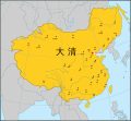
Re-centering the map of Qing dynasty (1765)[edit]
 Done
Done
Map of Qing dynasty in 1765

Article(s): ko:청나라
- Request
- The Sakhalin island was a part of the empire but it is currently running off the border of the image. The map needs to be re-centered to include the whole island. Can anyone help? --Benzenekim (talk) 07:17, 12 March 2022 (UTC)
- Graphist opinion(s)
![]() Request taken by En rouge (talk) 14:39, 27 May 2022 (UTC)
Request taken by En rouge (talk) 14:39, 27 May 2022 (UTC)
- Done
The width of the Qing Dynasty map has been enlarged:
- as suggested in [5] by @Geographyinitiative: on 2021-07-01 19:15
- as requested in [6] by @Benzenekim: on 2022-03-09 22:52
- as requested in Commons:Graphic_Lab/Map_workshop by Benzenekim on 2022-03-12 07:17
The map was adjusted:
- full display of Sakhalin
- extended Japanese coastlines
- extended Philippine coastlines
Additionally, the sibling files, in Spanish and Chinese, have also been updated:

español
Done
中文
Done


![]() Done En rouge (talk) 12:52, 28 May 2022 (UTC)
Done En rouge (talk) 12:52, 28 May 2022 (UTC)
Wrong borders[edit]

First French Empire before the french invasion of Russia on World 1812.

Colonial empires in 1812

Colonisation 1754

Colonial empires in 1800

Colonial empires in 1822


Article(s): Various
- Request
- The creator of the first two maps (First French Empire and Colonial empires in 1812) conflated 1812 with 1912 and added Morocco as a satellite state of the First French empire in 1812 which is totally unhistocal. Morocco was made a protectorate of France in 1912
- The three other maps (Colonisation 1754, Colonial empires in 1800 and Colonial empires in 1822) are also unhistorical maps. The northern part of Morocco was made a protectorate of Spain in 1912 and Western Sahara was made a Spanish colony in 1884.
- Can someone remove Morocco and western Sahara from these maps? --197.153.44.161 00:24, 17 March 2022 (UTC)
- Graphist opinion(s)
![]() Request taken by M.Bitton (talk) 00:38, 17 March 2022 (UTC)
Request taken by M.Bitton (talk) 00:38, 17 March 2022 (UTC)
- I suppose that by "remove", you mean remove the green colour from the first two and the yellow colour from the other three, while using the first as a base map. Let me know if I got it wrong. M.Bitton (talk) 00:38, 17 March 2022 (UTC)
- Remove the light green color from the first two maps and remove the yellow color from the three other ones. Leave the borders of the three maps as they are, in "Colonisation 1754" and in "Colonial empires in 1822" they are present-day borders, while in "Colonial empires in 1822" there are no borders. Thank you.197.153.44.161 00:58, 17 March 2022 (UTC)
- The present day borders in those maps are there to show the difference between then and now, I will leave them as they are and adjust the "1754" and "1822" maps using the first two as a base map. M.Bitton (talk) 01:04, 17 March 2022 (UTC)
- You will remove the present-day borders from the two maps (1754 and 1822)?197.153.44.161 01:10, 17 March 2022 (UTC)
- No, but I will adjust Morocco's map accordingly (in line with the others). M.Bitton (talk) 01:12, 17 March 2022 (UTC)
- But the maps are about Colonial powers, Morocco wasn't a colonial power or even a power. Are you going to add Morocco as a map symbol with its color?197.153.44.161 01:17, 17 March 2022 (UTC)
- True, but the same logic applies to the United States and the Ottoman empire (both shown as colonial powers). I expect the average reader to be familiar with the history of the former, so I won't delve into it, as for the latter (described as Turkey in two of the maps): even if we agree with the sources that say that it emerged as such during the late nineteenth century (second half of the nineteenth century at the earliest), these maps (depicting an earlier period) would still be incorrect. Here's what I'll do:
- First map: this is the easiest of the lot as all it needs is the removal of the green colour from Morocco. Although that doesn't make it perfect, since the Barbary States (which were at war with each other) are portrayed as a single country, it would still be a big improvement.
- The other maps: remove the green, yellow and dark grey colours from Morocco, Western Sahara, the United States and the Ottoman empire. For the "Colonial empires in 1800.svg", I will merge them with the rest of the continents (like the other countries that are not shown).
- Please note that overwriting files always comes with the risk of being reverted. Should that happen (though I doubt it in this case), the new maps will have to be uploaded under new names. M.Bitton (talk) 19:27, 17 March 2022 (UTC)
- True, but the same logic applies to the United States and the Ottoman empire (both shown as colonial powers). I expect the average reader to be familiar with the history of the former, so I won't delve into it, as for the latter (described as Turkey in two of the maps): even if we agree with the sources that say that it emerged as such during the late nineteenth century (second half of the nineteenth century at the earliest), these maps (depicting an earlier period) would still be incorrect. Here's what I'll do:
- But the maps are about Colonial powers, Morocco wasn't a colonial power or even a power. Are you going to add Morocco as a map symbol with its color?197.153.44.161 01:17, 17 March 2022 (UTC)
- No, but I will adjust Morocco's map accordingly (in line with the others). M.Bitton (talk) 01:12, 17 March 2022 (UTC)
- You will remove the present-day borders from the two maps (1754 and 1822)?197.153.44.161 01:10, 17 March 2022 (UTC)
- The present day borders in those maps are there to show the difference between then and now, I will leave them as they are and adjust the "1754" and "1822" maps using the first two as a base map. M.Bitton (talk) 01:04, 17 March 2022 (UTC)
- Remove the light green color from the first two maps and remove the yellow color from the three other ones. Leave the borders of the three maps as they are, in "Colonisation 1754" and in "Colonial empires in 1822" they are present-day borders, while in "Colonial empires in 1822" there are no borders. Thank you.197.153.44.161 00:58, 17 March 2022 (UTC)
Examples of texts in maps ?[edit]
I uploaded File:Continental Basins of Mongolia - Asian Development Bank 2020.svg and used it on Wikipedia. But it looks small and ugly there, with all the text outside the frame. I want to edit it and put the names from the sidebar in the frame, hoping it won't block too much iof thetopographical features. Or possibly make tooltips. Can you point to some example or MOS of how it should be done with nice results ?

Danny lost (talk) 15:38, 18 March 2022 (UTC)
- Graphist opinion(s)
@Danny lost: Remove most of the text from the SVG map. This allows for avoding embeding the title of the map at the top and the small legend on the right. Use the template w:Template:Overlay to re-create the legend for each of the numbered features. This has addtional the advantage of being able to wikilink to articles like w:Tuul River.
In the article w:Land of the Blacks (Manhattan)#Development, I used this approach Overly template to add the legend. This approach has the advantage of reuse. The same SVG can be used across different languages. Ping me on this page if you have questions. - DutchTreat (talk) 13:17, 25 April 2022 (UTC)
- Thank you. This sounds helpful. I'll try it sometime... Danny lost (talk) 19:34, 4 May 2022 (UTC)
@Danny lost: Hi, it seems this image has not an appropriate license, and shall be removed from Commons. Its usage is only for personal use without written consent, see [7], "Copyright / Privacy" tab. Yours, En rouge (talk) 12:50, 28 May 2022 (UTC)
- @En rouge, hi, the document with the map has a prominent notice that reads: "Creative Commons Attribution 3.0 IGO license (CC BY 3.0 IGO)". I believe it is OK? Danny lost (talk) 12:05, 2 June 2022 (UTC)
- @Danny lost: hi, OK Danny, sorry for my previous comment.
- I saw that the website offered paid documents (and, for me, implicitly not a proper license for Commons).
- But, while downloading the document, I saw the CC BY 3.0 IGO license as you mention.
- Sorry again, yours, En rouge (talk) 23:06, 17 June 2022 (UTC)
File:Meemu Atoll.png contains wrong island names[edit]
Map with wrong island names

Article(s): en:Meemu Atoll and in 15 other language versions, plus articles on individual islands in de and ceb language versions [8]
- Request
- The map is nice, but the names of the islands do not fit the official list. Sometimes a name goes to the wrong island. Rather than making a request for deletion, I hope that somebody can fix this. (This is beyond my abilities, unfortunately.)
The issue came up in a discussion in de.wikipedia. Apparently some map makers are very "creative" when assigning names to the various islands. There is one source, onemap.mv, which is "the authoritative source for the National map of Maldives developed and maintained by the Maldives Land and Survey Authority under it’s mandate of creating the National Chart and maintaining the National land registry."[9] I strongly suggest to use the names shown at https://onemap.mv/. These names are sometimes different from those found at Google maps and sometimes also different from those found at a different government site, atollsofmaldives.gov.mv. Which makes the issue even more confusing. Examples from north to south (I actually find it easier to read and compare the table with maps from the bottom/south to the top/north):
| onemap.mv | Meemu_Atoll.png | atollsofmaldives.gov.mv | Google Maps |
|---|---|---|---|
| LD1626 | not existent (or combined with next) | not existent | not existent |
| LD1627 | Kekuraalhuvelee | not existent | not existent |
| Kekuraalhuveli | Gasveli | Gasveli | no Name |
| Dhekunuboduveli | Dhekunuboduveli | Dhekunuboduveli | no Name |
| Gasveli | Kudausfushi | Kuda usfushi | Mahufuri |
| somewhat bigger geographic gap | |||
| Kudausfushi | Maausfushi | Maa usfushi | no Name |
| Maausfushi | Maahuraa | no Name | no Name |
| Maahuraa | Fenfuraaveli | Maahuraa | Haafushi |
| Fenfuraaveli | Haafushi | Fenfuraaveli | Fenfuraaveli (only when name is searched for) |
| Kolhufushi (west of it 3 small islands) | Kolhufushi (no small islands) | Kolhufushi (no small islands) | Kolhufushi |
| Dhihthun'di | Dhiththundi (note spelling) | Dhihthun'di | no Name |
To find the area at onemap.mv, for example search for Kolhufushi. When going north from this region, there are also some deviations with the actual islands, not just the names, of "our" map and the official site. These probably also would need correction. So far I did not dare to check the maps of the other Maldivan attols. User:Helix84 is listed as creator of the png, User:Snowdog created the predecessor jpg. The text there states: Map originally vector'ed by Hassan Waheed, Aabaadhuge of Thinadhoo]] island. Not sure what that means. --Skopien (talk) 16:54, 20 March 2022 (UTC)
- Graphist opinion(s)
- @Skopien: Hi, do you have seen this recent upload:
 ?
? - Does it fit your requirements?
- yours, En rouge (talk) 21:40, 26 May 2022 (UTC)

Inner-Asian "civilisations"[edit]
_Azerbaijan.png/120px-Map_of_the_historical_region_of_(Iranian)_Azerbaijan.png)
An image of Iranian Azerbaijan to help you to locate it.

An image showing how Xinjiang can be divided based on the Chinese administrative subdivisions (even if based on the real geographic mountains, it can be better).

A map helping you to locate the Great Wall going all the way from Shanhai, Hebei to Jiayuguan, Gansu.

A map helping you to locate the rivers I’m talking about in Russia.
_Azerbaijan.png)


Article(s): Various and many, mainly related to politics, anthropology, linguistics, archeology, history and political ideologies
- Request
The map I need shows 5 territories in different colors. The map should be a flat world map that people can easily modify, like the ones usually found on Wikipedia. Several copies of the map can be exported, one without the borders of the countries of the world, one with the borders of the countries of the world and one in orthographic projection. If you don't have time, the simple one without the borders of the countries of the world will suffice. Attention, one of the territories represented on the map is itself divided by several borders.
1) "Japan" (bc002d color) :
Includes all the current Japan (main islands, islets, Nansei archipelago, etc.), Senkaku, the Kuril Islands, Sakhalin Island and the Kamchatka Peninsula.
2) 2) "Korea" (0055ff) :
Includes both Koreas (everything south of the Tumen River) and Jiandao (Gando).
3) "Turkic-Mongolic-Tungusic" :
You should draw the in this order for not getting in trouble.
3.1) "Western Turkic" (0099dd) :
Include Turkey, Northern Cyprus, Iranian Azerbaijan (West Azerbaijan, East Azerbaijan and Ardabil provinces of Iran), Azerbaijan.
3.2) "Mongolia" (0000ff) :
Includes all of Outer Mongolia and all of Inner Mongolia, including territories that seem to have been cut off from it such as the Josutu League or the Southern Chahar region in northern Hebei. Include everything located between the southern border of Inner Mongolia and the Great Wall of China as well. The part of Russia surrounded by Amur river, Outer Mongolia, Yenisei river-Angara river, Baikal lake, Lena river-Aldan river, Stanovoi range and Okhotsk sea is also included as "Mongolia".
3.3) "Manchuria" (ffcc22) :
Everything surrounded by "Mongolia" you drawn at the west, Amur river flowing to Sakhalin in the North, the sea at the east, Korea at the south and then use the Great Wall as a border with China until it reaches the Mongolian territory you drew that also use the Great Wall as a border with China. In China, it mainly covers the Jilin, Heilongjiang and Liaoning as well as some parts of others provinces like Hebei that are located at the North of the Great Wall.
3.4) "Northern, Southern and Eastern Turkic" (0099dd, same than Western Turkic) :
3.4.1) Territory :
Central Asia including Tajikistan, Wakhan Corridor in Afghanistan and in Russia : all of the lands located at the East of Tobol-Irtysh-Ob in Siberia that do not belong to "Mongolia", "Manchuria" or "Japan" until the Bering Strait. In China, include everything located in the North of the Tibetan Plateau and the Great Wall that you didn’t gave to "Mongolia" and "Manchuria", mainly it’s northern Gansu and Xinjiang.
3.4.2) Borders :
As you can see, this territory should be divided in 3 : Eastern, Northern and Southern. The border used between the Eastern "Turkic" part and Northern "Turkic" part is the Yenisei river. The border between the Southern "Turkic" and Northern "Turkic" is composed of : • In Turkmenistan, any natural border between the Caspian sea and the Aral sea. • The Aral sea itself crossed by the border in its middle. • The Syr-Daria river. • Any natural link between Syr-Daria river and the Altishahr-Dzungaria border. • In Xinjiang, the natural border between Dzungaria and Altishahr (Tarim Basin). Everything further, such as the "Turkic" part in Gansu located in the North of the Great Wall and finally reaching "Mongolia", belong to "North Turkic".
4) Other (light grey) :
• Turkmen-Uzbek little regions in the North of Afghanistan, Afghanistan.
• Zanjan province, Iran
• Gagauzia, Moldavia
• Astrakhan Oblast, Russia
• Bashkortostan, Russia
• Chuvashia, Russia
• Crimea, Ukraine/Russia
• Daghestan, Russia
• Kabardino-Balkaria, Russia
• Karachayevo-Cherkessia, Russia
• Tatarstan, Russia
• Regions of Russia located between Kazakhstan and Bashkortostan-Chuvashia-Tatarstan, Russia.
• The area between the Ural Mountains (historical border between Europe and Asia) and the Tobol-Irtysh-Ob, Russia.
- Graphist opinion(s)
Survey: Help improve Kartographer[edit]
Sorry for cross-posting
Do you create interactive maps with Kartographer (mapframe)? If your answer is yes, we would like to hear from you. Please take part in our survey and help improve Kartographer! Where do you run into problems using it? Which new features would you like to see? Editors of all experience levels and with all workflows around Kartographer are welcome to participate.
Here is the survey: https://wikimedia.sslsurvey.de/Kartographer-Workflows-EN/
- The survey is open until March 31.
- It takes 10-15 minutes to complete.
- The survey is anonymous. You don't need to register, and we will not store any personal data which identifies you, such as your name or IP address.
Unfortunately, the survey is only available in English, but we have tried our best to use simple English and to add visual examples. If English is not your native language, it might help to use a translation tool in your browser.
Some background: Wikimedia Germany's Technical Wishes team is currently working on the Kartographer extension. Over the last few months, we have been working on a solution to make this software usable on wikis where it isn’t available yet. In the next phase of the project, we are planning to improve Kartographer itself. Because Kartographer is used quite a lot on this wiki, we would love to hear about your experiences. More information on our work with Kartographer and the focus area of Geoinformation can be found on our project page.
Thank you for your help! – Johanna Strodt (WMDE) (talk) 09:44, 21 March 2022 (UTC)
1840 map of the Holy Land / Palestine (modern Israel)[edit]
.jpg/54px-Heinrich_Kiepert_1841_map_of_Palestine_(combined).jpg)
My amateur version of the combined map
Original file (north)
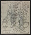
Original file (south)
.jpg)


Article(s): History of Palestine (as new lead image, replacing existing) and Cartography of Palestine and Ottoman Syria and Biblical Researches in Palestine. Also extracted versions at Acre Sanjak, Nablus Sanjak, Jerusalem Sanjak etc
- Request
- Create an improved version of the 1841 Kiepert map of Palestine
This map is a milestone in the history of maps of the Holy Land. A large part of this recent book is dedicated to it: Schelhaas, B. (2017) Mapping the Holy Land: The Foundation of a Scientific Cartography of Palestine, Bloomsbury Publishing ISBN: 978-0-85772-785-5. The map was the key illustration in the foundational book of the study of the Holy Land: Biblical Researches in Palestine by Edward Robinson (scholar); on p.16 of the book just linked they quote: "Perhaps, Robinson’s most important accomplishment, however, was the drawing of new maps of the whole region. For this purpose he hired a young German map maker, Heinrich Kiepert… Through his efforts the maps of ancient Israel were thoroughly revised and improved; modern cartography of the Holy Land begun."
In additional to Biblical Geography, the maps also are the first which show the detailed subdivisions of contemporary Palestine. The maps currently in the lede of en:History of Palestine will have been copied (with minor adjustments) from this map.
I would like this map to be widely used throughout Wikipedia. Before I start linking it and creating extract files, I wanted to ask if anyone here would be willing to improve it (the file currently linked above is my amateur attempt at creating a combined file and making the colors more vivid). It could also become a Featured Picture. Perhaps the most important improvement it needs is to remove the yellow background whilst maintaining the rest of the coloring. --Onceinawhile (talk) 15:08, 23 March 2022 (UTC)
- Graphist opinion(s)
![]() Done
Well, Onceinawhile, at least a first attempt, please check for mistakes. (Refresh to get new version.) Zero0000 (talk) 13:49, 31 March 2022 (UTC)
Done
Well, Onceinawhile, at least a first attempt, please check for mistakes. (Refresh to get new version.) Zero0000 (talk) 13:49, 31 March 2022 (UTC)
- Hi Zero0000! Thank you. Yours is a big improvement, both in resolution and in color.
- I had a close up look at some of the subdivision lines and the colors look a bit odd in places on my screen. For example the horizontal line east of Sidon and the vertical line between Sidon and Beirut, look multi-colored, and the thin boundary lines of Mount Lebanon and the area around Tripoli (some bluish and some greenish) are quite hard to see. Ideally the boundary colors would be as vivid and clear as on the map File:Modern Palestine, Illustrated atlas, and modern history of the World, 1851.jpg, but I have no idea how to do that in an efficient manner. Onceinawhile (talk) 14:28, 31 March 2022 (UTC)
- Onceinawhile, apart from a few lines in one of the cutouts at top left that are almost invisible in the original, I just enhanced the colored lines by saturating them. So variations in color along the same line are present in the originals, and the width of the lines is exactly what is in the originals. I can reduce the colour variation without too much effort, but making it look similar to the 1851 map would required manually drawing new lines that are wider (more than twice in many cases) than the originals. I'm not sure that is a valid objective; it feels like illicit image manipulation. Zero0000 (talk) 02:09, 1 April 2022 (UTC)
- I don't understand your comment about the lines around Tripoli. There are no greenish lines (except the one around the city) and they are perfectly visible at full resolution. Zero0000 (talk) 02:31, 1 April 2022 (UTC)
- Sorry I didn’t mean Tripoli, I meant Beirut in the main map – both the area to the northeast and to the southeast. In my original attempt, I fiddled with the image parameters so much that these colors became clear to see on the main map; unfortunately the yellow map background became much too strong at the same time. Onceinawhile (talk) 05:23, 1 April 2022 (UTC)
- I can go over the lines with more intense versions of the same colors, without making the lines wider. That would make them more uniform and visible, but only the thicker lines will stand out at lower resolution. It isn't really true to the original map and that bothers me. Do we want to display the map, or just the information in the map? Zero0000 (talk) 03:17, 1 April 2022 (UTC)
- Hi Zero0000 my thinking is that originally the base map would have been pure white (it is the lignin in the paper which yellows with age) so the colored boundary lines would have much more vivid. Onceinawhile (talk) 05:19, 1 April 2022 (UTC)
- It would have been some off-white color. Pure white paper was only a few decades old and expensive. But, sure, it would have been whiter than these images. The basic reason why increasing the saturation of the lines didn't work well is that the non-uniform discoloration of the paper includes the colored bits so they are nonuniform too. I'm trying a different method that gives uniform color and I can make the whole thing brighter. But the finest lines are still very thin and that limits the visibility no matter what the colors are. I really don't want to make them thicker. The original paper map was at full resolution all the time. Incidentally it is a waste of time to play with overall color mapping, there is too much overlap between the yellowing of the paper and the colors in the lines. Zero0000 (talk) 06:52, 1 April 2022 (UTC)
- This makes complete sense to me, agree with everything you said. Onceinawhile (talk) 09:07, 1 April 2022 (UTC)
- OK, I have a system now. A bit laborious but gives ok results. Zero0000 (talk) 08:00, 1 April 2022 (UTC)
- I don't know what you are doing but it sounds like magic! Onceinawhile (talk) 09:07, 1 April 2022 (UTC)
- Onceinawhile, hard work more like it. Second attempt uploaded. Two things: I replaced one or two colors that were indistinguishable in their faded original state; Sometimes the colored highlights deviate significantly from the boundary (which appears on the map as a dashed line), in which case I followed the highlights. Zero0000 (talk) 13:33, 1 April 2022 (UTC)
- Hi @Zero0000: that is wonderful. It looks excellent. I have gone through and compared it to the original and I can't see anything missing (perhaps with the exception of the little ring around Beirut?). Thank you so much. After all that work I thought you might enjoy reading Herr Kiepert's explanation of his work:[10] 11. Division into Provinces and Districts. This has been done, by way of trial, from the Lists of Arabic names of places collected by Mr. Smith, and found in the Second Appendix to the present volume. Very often, however, the exact boundaries remained doubtful; partly because many known places do not occur in the lists; and partly because of several districts there yet exist no lists at all; e. g. Yafa, Haifa, Belâd Besharah, Belâd esh-Shủkif, etc. The boundaries of the subdivisions, in particular, were difficult to be determined accurately; and they are consequently for the most part omitted. Nevertheless, even this approximation to a more exact division, will afford a more definite and correct view, than has been the case with the attempts in all former maps, founded as they were on far more imperfect data.
- Are you happy for me to use it to the various proposed pages now? Onceinawhile (talk) 14:16, 1 April 2022 (UTC)
- I brightened Beirut, softened the edges of the coloured highlights a tiny bit, and did some inconsequential tweaking. I'm happy for it to go into production now. Zero0000 (talk) 02:02, 2 April 2022 (UTC)
- Thank you Zero. Before extracting pieces I have started writing an article on the topic - see Kiepert maps of Palestine and Jerusalem. Onceinawhile (talk) 07:26, 2 April 2022 (UTC)
- I brightened Beirut, softened the edges of the coloured highlights a tiny bit, and did some inconsequential tweaking. I'm happy for it to go into production now. Zero0000 (talk) 02:02, 2 April 2022 (UTC)
- Onceinawhile, hard work more like it. Second attempt uploaded. Two things: I replaced one or two colors that were indistinguishable in their faded original state; Sometimes the colored highlights deviate significantly from the boundary (which appears on the map as a dashed line), in which case I followed the highlights. Zero0000 (talk) 13:33, 1 April 2022 (UTC)
- I don't know what you are doing but it sounds like magic! Onceinawhile (talk) 09:07, 1 April 2022 (UTC)
- It would have been some off-white color. Pure white paper was only a few decades old and expensive. But, sure, it would have been whiter than these images. The basic reason why increasing the saturation of the lines didn't work well is that the non-uniform discoloration of the paper includes the colored bits so they are nonuniform too. I'm trying a different method that gives uniform color and I can make the whole thing brighter. But the finest lines are still very thin and that limits the visibility no matter what the colors are. I really don't want to make them thicker. The original paper map was at full resolution all the time. Incidentally it is a waste of time to play with overall color mapping, there is too much overlap between the yellowing of the paper and the colors in the lines. Zero0000 (talk) 06:52, 1 April 2022 (UTC)
- Hi Zero0000 my thinking is that originally the base map would have been pure white (it is the lignin in the paper which yellows with age) so the colored boundary lines would have much more vivid. Onceinawhile (talk) 05:19, 1 April 2022 (UTC)
1992 Summer Olympics medal map.png[edit]

Participating nations during the 1992 Summer Olympics

2020 Summer Olympics medal map


Article(s): en:1992 Summer Olympics medal table
- Request
- I would like a colored map to be created showing medal results for each nation during the 1992 Summer Olympic using the 1992 Summer Olympics participating countries map in the first image. The first image is also a reference guide to the nations that did participates in the 1992 Summer Olympics. I also posted an example from the 2020 Summer Olympics showing medals results with countries in gold (for nations that won at least one gold medal), silver (nations that won at least one silver medal, but no gold medals), bronze (nations that ONLY won at least one bronze medal), blue (nations that won zero medals), and red (nations that did not participate in that year's Olympics) --Birdienest81 (talk) 13:34, 6 April 2022 (UTC)
- Graphist opinion(s)
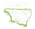
Map of the Fens (Convert into SVG)[edit]

Map of the Fens (Please convert to SVG and remove reference to the Isle of Axholme)


Article(s): Various
- Request
- Please can a new version of this map which is dated from 2006 and not in SVG be created with all references to the Isle of Axholme to be removed as it is not part of the Fens with the towns and cities which are mentioned on the map along with the names of the fens and possibly the courses of the major rivers what flow within the Fens. (MOTORAL1987 (talk) 08:32, 10 May 2022 (UTC))
- Graphist opinion(s)
![]() Done – See new map above MOTORAL1987. Rcsprinter123 (talk) 21:49, 11 May 2022 (UTC)
Done – See new map above MOTORAL1987. Rcsprinter123 (talk) 21:49, 11 May 2022 (UTC)
- Oh thank you so much the new map is fantastic however can we make two final changes, please can Grimsby be removed as it’s nowhere near the Fens and also can a border be added just to show a rough outline of the area of the fens just like as shown in the map. (MOTORAL1987 (talk) 04:21, 12 May 2022 (UTC))
- OK, given that an update for you. Rcsprinter123 (talk) 21:28, 15 May 2022 (UTC)
Cheers May I request three further very minor alterations to the map please.
- 1. Can the towns of Downham Market and Market Deeping be added.
- 2. Can the red western border around Lindsay Level and Deeping Feen be modified slightly further westwards so it shows Market Deeping to properly show Deeping Fen and Market Deeping within it.
.jpg)
This map here shows in the best way what the outline of the red broundry in a more realistic way,
- 3. In a different colour can the county outlines of Lincolnshire, Cambridgeshire, Norfolk and Suffolk be added into the map too.
I hope this doesn’t cause too many issues as in too much information. (MOTORAL1987 (talk) 11:04, 15 June 2022 (UTC))
Translating the Elizabeth line map into Malay[edit]

The Elizabeth line route map as of May 2022
.svg/120px-Elizabeth_line_Map_as_in_May_2022_(ms).svg.png)
The Elizabeth line route map as of May 2022 in Malay language
Article(s): Laluan Elizabeth
- Request
- Hi. Can someone translate the image attached into Malay language (code lang: ms)? The translations are as follow (English → Malay):
- Elizabeth line operating as 3 separate sections (2022) → Laluan Elizabeth beroperasi sebagai 3 seksyen berasingan (2022)
- Above-ground station → Stesen atas tanah
- Station in tunnel → Stesen dalam terowong
- Interchange → Pertukaran
- 2 mi → 2 bt
- London fare zone inapplicable → Zon tambang London tidak terpakai
- Heathrow Airport. Special fares apply. → Lapangan Terbang Heathrow. Tambang istimewa dikenakan.
- Central London → London Tengah
- City Airport (proposed) → City Airport (dicadangkan)
- Special fares apply → Tambang istimewa dikenakan
- River Thames → Sungai Thames
Thank you and regards. -- 26 Ramadan (talk) 11:44, 3 June 2022 (UTC)
- Graphist opinion(s)
@26 Ramadan: Why don't you have a go at changing it yourself? It's extremelly easy as all you have to do is: download the svg, open the file using a text editor, search and replace the text and then upload under a new name. If for some reason, the replaced text doesn't fit properly, post here again and I'm sure someone will adjust it for you. Best, M.Bitton (talk) 16:56, 3 June 2022 (UTC)
- @M.Bitton: Done. Translated map as above. Thank you for the recommendation. 26 Ramadan (talk) 09:58, 6 June 2022 (UTC)
Making a SVG version of church map[edit]

Saint-Antoine-l'Abbaye church

Article(s): fr:Abbaye de Saint-Antoine-l'Abbaye
- Request
- Making a SVG version.
- Making a SVG version of the church map. See also older and more complete version online. Thanks, --Yann (talk) 19:12, 20 June 2022 (UTC)
- Graphist opinion(s)
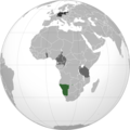
Commonwealth republics map - Gabon and Togo[edit]

Article(s): Any article this already appears on.
- Request
- Could someone please alter the above map of the republics within the Commonwealth of Nations so that Gabon and Togo are shaded red, as they joined the Commonwealth as republics on 25 June this year. Thanks. Snow Lion Fenian (talk) 16:54, 1 July 2022 (UTC)
- Graphist opinion(s)
@Snow Lion Fenian: ![]() Done M.Bitton (talk) 22:09, 18 July 2022 (UTC)
Done M.Bitton (talk) 22:09, 18 July 2022 (UTC)
- @M.Bitton: That's great, thanks for helping out. Snow Lion Fenian (talk) 22:18, 18 July 2022 (UTC)
London railway stations and termini[edit]
Description of first image

Article(s):
- Request
- Needs updating and drawing of borders and lines.
- Details of your request go here…
I noticed that there was no free map on Wikipedia showing the various railway stations in central London on a map, along with their lines and destinations. The closest I saw was this: File:Major railway stations of London map.svg, which is quite well made with a good map background and lines, but isn't complete (e.g. Moorgate is missing), outdated now (with opening of Elizabeth line) and it only shows a border for the City which doesn't tell much.
So I set out to create one myself using that SVG as a stepping stone. I don't know how to work with SVG hence I created my file in a separate software using layers in PNG format. The result was this: File:Railway stations, lines and termini in central London.png. My map shows quite clearly all the stations along with coloured lines (inc. the new Elizabeth line), the names/operators, and commuter destinations.
However I know it'd be best if that original SVG can be improved to bring it in line with that - the problem is I don't know how to do it myself so am requesting if others are willing to perform it. The changes that I see ideally need to be made to that SVG are:
- Update it to show the Elizabeth line railway track
- Add missing termini like Moorgate, as well as other stops in the area like City Thameslink
- Put accurate borders with purple outlines for the other boroughs in the area (Westminster, Camden, Lambeth etc.)
With an improved and complete version like that, we'd have a good raw map, and it can be used to create a version with coloured lines and operator/destination names as I did before with that PNG.
--Manche Captain (talk) 16:43, 5 July 2022 (UTC)
- Graphist opinion(s)
Mali Orthographic Projection[edit]
.svg/120px-Mali_(orthographic_projection).svg.png)
Mali (orthographic projection)
.svg)
Article(s): Mali (English Wikipedia)
- Request
- Add the border between Ethiopia and Eritrea.
- Details: For some reason the map of Mali in Africa does not show the border between the East African countries of Ethiopia and Eritrea, could someone please add the border to the map?--JSeb05 (talk) 17:23, 9 July 2022 (UTC)
- Graphist opinion(s)
@JSeb05: ![]() Done. M.Bitton (talk) 22:06, 18 July 2022 (UTC)
Done. M.Bitton (talk) 22:06, 18 July 2022 (UTC)
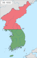
Korean Islands Problems[edit]
Korean War Map

.svg)
.png)
.svg)
![[1]](https://en.wikipedia.org/wiki/File:The_Mid-Atlantic_States.png)
![[2]](https://en.wikipedia.org/wiki/File:Map_of_the_North_Eastern_United_States.svg)
.svg&action=edit&redlink=1)
.svg)
![[5]](https://commons.wikimedia.org/w/index.php?title=File:Map_of_Qing_dynasty_18c.svg&diff=prev&oldid=572674157)
![[6]](https://commons.wikimedia.org/w/index.php?title=File:Map_of_Qing_dynasty_18c.svg&diff=prev&oldid=637122489)
![[8]](https://commons.wikimedia.org/w/index.php?title=Special:GlobalUsage&offset=&limit=500&target=Meemu+Atoll.png)
Article(s): Korean War
- Request
- Issue A: Baengnyeongdo is under South Korean administration.
Issue B: Ulleungdo, larger than Baengnyeongdo, is omitted from the map. See page for details.
--Geographyinitiative (talk) 17:46, 9 July 2022 (UTC) - Graphist opinion(s)